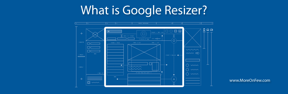
Google has launched a new service named Resizer. Google resizer is basically an interactive viewer which helps you to view your website in various design breakpoints across devices like Desktop, Mobile and Tablet. This service would help you test your website under some pre-defined breakpoints that Google has come up with across various devices. As per Google Designs, for optimal user experience, the website should adapt its layouts ideally for the breakpoint widths like 480px, 600px, 840px, 960px, 1280px, 1440px, and 1600dp.
Please Note: The Google Resizer services has been stopped by Google. However, I’m leaving this article in place just for reference.
What is the benefit of using Google Resizer ?
Well to start with I would say that Google Resizer would let you test your website under a combination of different breakpoints across different devices. On a Desktop device you’ll be able to see how does your website respond to the Breakpoints like 480px, 600px, 840px, 960px, 1280px, 1440px ,1600px and 1920px. However if you select the mobile device under Resizer, you get breakpoints like 360px, 600px, 720px and 1024px.
You can use Google Resizer to even show your site to your designer or stakeholders to give them a feel of how would your website look on various device breakpoints.
How do I use Google Resizer ?
Using Google Resizer is really simple. All you need to do is :
- Visit Google Resizer’s webpage at http://design.google.com/resizer/
- Type your website’s address in the address bar given on the top of the webpage and hit Enter.
- Once your webpage loads in the mockup screens shown on the homepage, you are ready to go.
- You may switch between devices from the Device Icons given on the top of the page.
- Once you have selected a Device, you can choose to view your page under different breakpoints by clicking on the Breakpoint value specified right under the address bar.
Well, that’s pretty much it. You can now play around with different breakpoints.
While the Google Resizer seems to be a good service, I really suggest that you develop your webpages to be fluid and responsive so that it looks good on devices whose breakpoint might be between the ones provided by Google Resizer. Never develop your webpages just for these breakpoints.
Hope you liked the tool. Let us know about your views on Google Resizer.